Adobe Illustrator isn’t just a vector graphics powerhouse—it’s also a robust tool for creating sophisticated typographic designs. Whether you’re designing a logo, poster, website header, or brand identity system, understanding how to work with type in Illustrator is essential.
In this chapter, we’ll walk through the fundamental tools and techniques for working with text in Illustrator, then explore advanced methods to create dynamic and customized typography. We’ll also introduce how artificial intelligence can help streamline the font selection process, a task that often trips up even experienced designers.
1. Typing Text in Illustrator: The Basics
Getting started with type in Illustrator is as simple as selecting the Type Tool (T) from the toolbar. Illustrator offers two main text types:
-
Point Type: Click anywhere on the canvas and start typing. This is best for headers or short phrases.
-
Area Type: Click and drag to create a text box. This is better for paragraphs or body text.
Once your text is placed, open the Character and Paragraph panels via Window > Type > Character / Paragraph. These panels give you full control over the formatting of your text:
-
Font Selection: Choose from your installed fonts or activate new ones via Adobe Fonts.
-
Font Size: Adjust the size using points (pt).
-
Leading: Control the space between lines.
-
Kerning: Fine-tune the space between two specific characters.
-
Tracking: Adjust spacing across a range of letters.
 The Type tool lets you add text to your designs. Image by Adobe.
2. Advanced Typography: Going Beyond the Basics
Once you're comfortable with basic type editing, Illustrator opens up a world of creative possibilities. Here are a few advanced techniques:
Convert Text to Outlines
Select your text and go to Type > Create Outlines (or press Shift+Ctrl/Cmd+O). This turns your live text into vector shapes. You can then use the Direct Selection Tool (A) to manipulate individual anchor points and paths, transforming letterforms into unique logos or design elements.
Tip: Always keep a copy of the original live text in case you need to edit it later.
Type on a Path
Want to wrap text around a circle or make it follow a wavy line? Use the Type on a Path Tool (click and hold the Type Tool to reveal it). Simply draw a path with the Pen Tool (P) or Ellipse Tool (L) and click on it with the Type on a Path Tool.
You can control how the text flows along the path in Type > Type on a Path > Type on a Path Options.
 The Type on a Path tool lets you enter type that follows a shape or path. Image by Adobe.
Stylize Text with the Appearance Panel
The Appearance panel (Window > Appearance) lets you apply multiple strokes, fills, and effects to a single text object—without converting it to outlines.
You can add:
-
Multiple fills and strokes (each with different colors or opacities)
-
Effects like shadows, glows, or 3D effects (via Effect > Stylize)
This is a non-destructive way to make your typography pop.
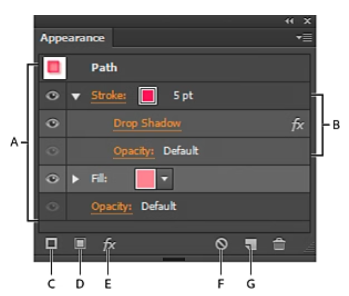 Appearance Panel. Image by Adobe.
3. Choosing Fonts: Where AI Comes In
One of the trickiest—and most time-consuming—parts of working with type is choosing the right font. Illustrator includes access to Adobe Fonts, but finding the perfect font or pairing often takes trial and error.
Here’s where AI comes to the rescue:
Font Identification Tools
Tools like WhatTheFont or Adobe Capture allow you to upload an image of a font you like (from a poster, website, etc.) and quickly identify similar fonts.
-
Use Case: You saw a stunning typeface on a website—upload a screenshot, and AI tells you which font it is or what matches best.
AI Font Pairing Tools
Web apps like Fontjoy, Typ.io, or Designscout.ai use machine learning to suggest font combinations based on harmony, contrast, and aesthetic principles.
-
Use Case: You’ve chosen a bold headline font—AI tools suggest the perfect minimalist body font to go with it.
4. Best Practices for Working with Type in Illustrator
To wrap up, here are some practical tips for clean, professional typography:
-
Limit your font choices: Stick to 2–3 fonts per design to maintain visual harmony.
-
Use grids and guides to align text elements consistently.
-
Convert to outlines only when finalizing, to preserve editability until the last step.
-
Watch your spacing: Kerning and leading make a big difference in readability.
-
Use AI tools as a guide, not a crutch—always make final decisions based on your design goals.
Final Thoughts
Typography is more than just choosing fonts—it's about creating visual language. With Illustrator’s comprehensive toolset and the assistance of AI-powered resources, you can elevate your text from ordinary to impactful. As you experiment with these tools and techniques, you’ll develop an intuitive sense for type—and that’s one of the most valuable assets a designer can have.
Comments
Post a Comment