Effective color use is one of the most essential elements in graphic design. In Adobe Illustrator, designers are equipped with a powerful color management toolkit that helps turn creative ideas into visually compelling artwork. Whether you're working on branding, illustration, or digital products, understanding how to work with Swatches, Gradients, and Color Harmony can elevate your designs from good to great.
1. Swatches: Your Color Library
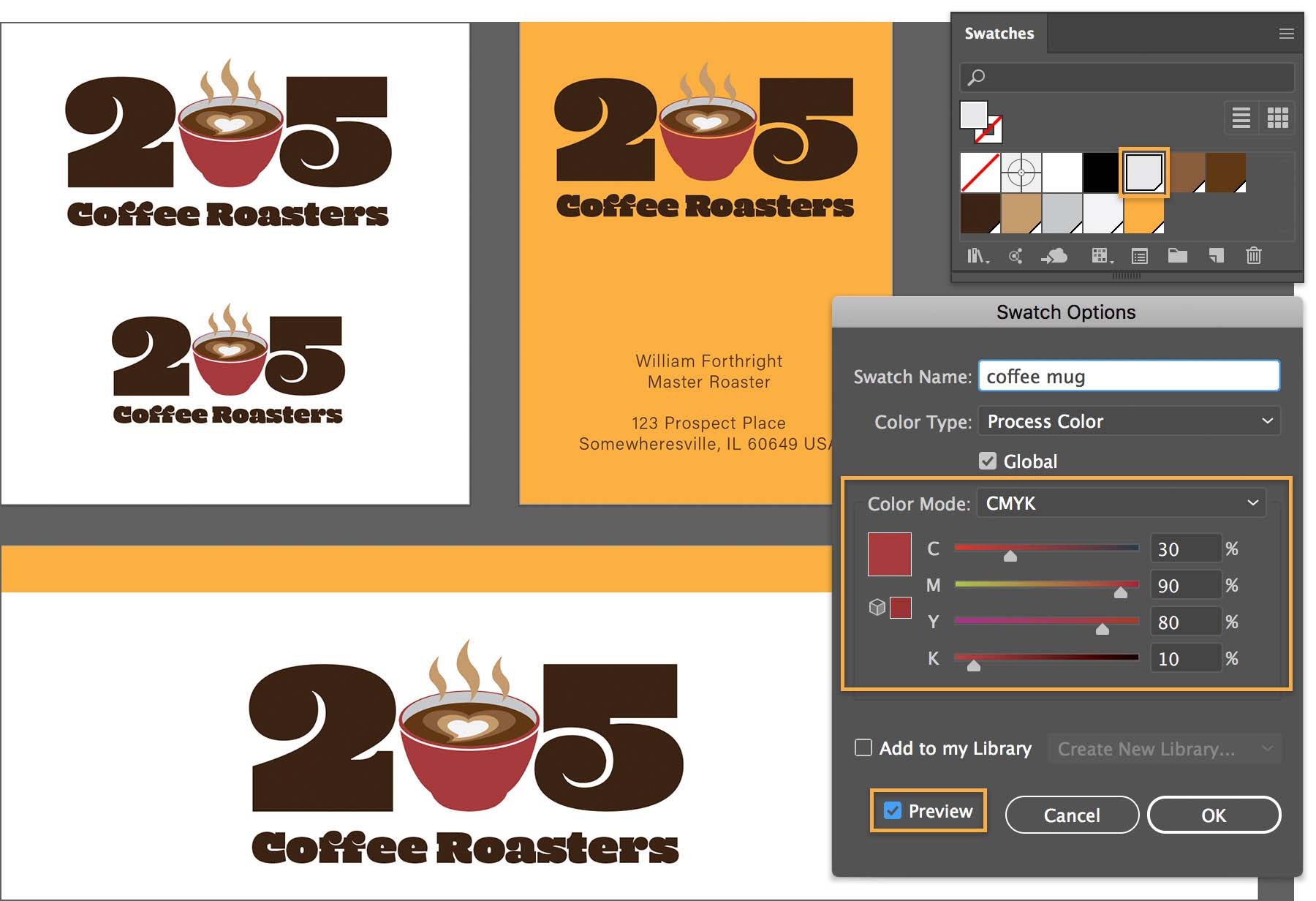
In Illustrator, the Swatches panel (Window > Swatches) is your main color library. It stores solid colors, gradients, and even patterns for quick access and reuse.
What You Can Do with Swatches:
-
Use Default Libraries: Illustrator includes a range of pre-made color libraries such as CMYK, RGB, Pantone, and more.
-
Create Custom Swatches: You can save any color you create as a swatch for consistency across your design.
-
Import Swatch Libraries: Bring in palettes from Adobe Color, downloaded ASE files, or external libraries.
📌 Pro Tip: Use swatch groups to organize colors by project or theme to stay visually consistent.
 Swatches Panel Overview. Image by Adobe
2. Gradients: Adding Depth and Dimension
Gradients are a dynamic way to bring dimension and emotion to your artwork. Illustrator offers a robust Gradient panel (Window > Gradient) for full control over gradient design.
Types of Gradients:
-
Linear Gradient: A smooth transition along a straight path.
-
Radial Gradient: Transitions outward from a central point.
-
Freeform Gradient: Allows you to place color points anywhere for organic blending.
Gradient Controls:
-
Adjust color stops to choose which colors appear and where they start or end.
-
Change angle, direction, and opacity for more control.
-
Save your gradient as a swatch to reuse it easily.
📌 Use Case: Gradients are perfect for backgrounds, UI elements, or adding realism to flat icons.

A. Linear gradient B. Radial gradient C. Freeform gradient (Points)
(Image by Adobe)
3. Color Harmony: Designing with Purpose
Choosing the right colors isn't just about taste—it’s about theory. Color harmony refers to combinations of colors that are visually pleasing and effective in conveying a message.
Generate stunning palettes with Adobe's Color Wheel
Use the Color Wheel to create harmonious colors that make a palette. Choose your base color, then select from a variety of color harmonies like analogous, triadic, complementary, and more to create beautiful designs.
4. Using AI Color Palette Generators
Designers today can supercharge their workflow using AI-powered color palette generators. These tools go beyond traditional theory by using machine learning to suggest harmonious color schemes.
How AI Color Tools Help:
-
Extract colors from images: Upload a photo and get a palette based on the dominant hues.
-
Generate themes from keywords: Input words like "sunset," "futuristic," or "vintage" to get tailored color suggestions.
-
Analyze context and mood: Some tools recommend palettes based on emotional impact or cultural trends.
Top AI Palette Tools:
-
Coolors – Generates palettes based on themes or randomness.
-
Khroma – Learns your preferences over time.
-
Adobe Color (with AI features) – Now integrates with your CC Library.
📌 Inside Illustrator: Try the Recolor Artwork feature (Edit > Edit Colors > Recolor Artwork), which includes Generative Recolor—a text-prompt-based AI tool that adjusts your design’s palette automatically.
 Generative Recolor in Illustrator. Image by Adobe
Conclusion
Mastering color in Illustrator involves more than picking pretty shades—it's about working smart with swatches, gradients, and harmony principles. With the added power of AI color palette tools, you can enhance creativity, speed up your workflow, and deliver color-consistent, visually impactful designs.
✅ Quick Recap
-
Use Swatches to store and apply consistent colors.
-
Use Gradients for smooth color transitions and visual depth.
-
Apply Color Harmony principles to create aesthetically balanced designs.
-
Leverage AI Color Palette Generators for inspiration and speed.
By integrating these techniques into your workflow, you'll not only improve your Illustrator skills but also develop a more intuitive, effective approach to color in design.
Comments
Post a Comment