Introduction to Color Theory and Psychology (Utilizing Online Color Tools)
Color is more than decoration in design — it is a powerful language. Whether you’re building a brand, designing a website, or creating artwork, color influences how your audience feels, thinks, and responds. Understanding how color works and how to use it effectively is a crucial step for every designer.
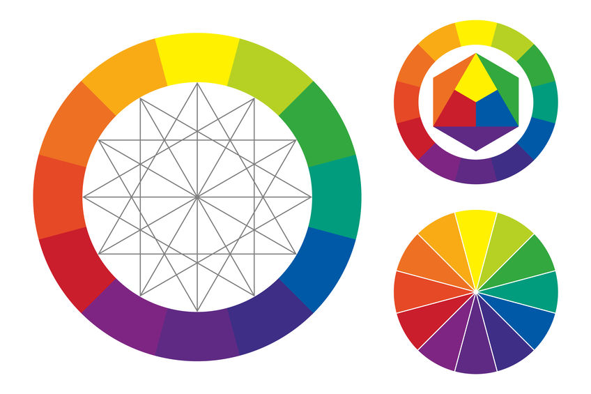
 Color Wheel illustration by BetterDesign.Space🎨 Understanding the Color Wheel

At the heart of color theory lies the color wheel — a circular diagram that shows how colors relate to one another. This tool forms the foundation for creating harmonious and visually pleasing color schemes.
-
Primary colors: Red, yellow, and blue. These cannot be made by mixing other colors.
-
Secondary colors: Orange, green, and violet. These are made by mixing two primary colors.
-
Tertiary colors: Created by mixing a primary color with a neighboring secondary color, like red-orange or blue-green.

🎯 Color Harmonies: The Art of Color Combinations
Using the color wheel, designers can build color harmonies — combinations that are visually satisfying and emotionally balanced.
-
Complementary: Colors directly opposite on the wheel (e.g., blue and orange). These create strong contrast and energy.
-
Analogous: Colors that sit next to each other (e.g., green, blue-green, and blue). These feel cohesive and natural.
-
Triadic: Three colors evenly spaced around the wheel (e.g., red, yellow, blue). These offer vibrant yet balanced contrast.
Each harmony has its own mood and best use cases depending on your design goals.

🧠 The Psychology of Color: Emotion in Design
Colors do more than just look good—they communicate on a psychological level. Different hues can trigger specific emotional responses, making color a critical tool in shaping how people perceive a brand, product, or message.
| Color | Emotion/Meaning |
|---|---|
| Red | Energy, passion, urgency |
| Blue | Calm, trust, professionalism |
| Yellow | Optimism, warmth, creativity |
| Green | Growth, health, nature |
| Purple | Luxury, mystery, creativity |
| Black | Sophistication, elegance, power |
| White | Cleanliness, simplicity, peace |
⚙️ Tools of the Trade: Online Color Palette Generators
The web is filled with tools that make experimenting with color easy and fun. Here are some excellent resources to try:
-
Coolors.co – Instantly generate color palettes and explore trending combinations.
-
Adobe Color – Build harmonies from the color wheel, extract palettes from images, and test accessibility.
-
Color Hunt – Curated collection of trendy color palettes.
-
Paletton – Interactive color scheme designer.
These tools often include color psychology tags, accessibility checks, and export options to speed up your workflow.
👁️🗨️ Color Contrast and Accessibility
Design isn’t just about aesthetics — it must also be readable and accessible. The contrast between text and background is vital for user experience, especially for those with visual impairments.
-
Use tools like WebAIM’s Contrast Checker to ensure your text meets accessibility standards (e.g., WCAG 2.1).
-
Aim for a contrast ratio of 4.5:1 or higher for body text.
Poor contrast not only leads to frustration but can also drive users away from your design.
✅ Key Takeaways
-
The color wheel helps you understand the relationships between colors.
-
Color harmonies guide you in creating pleasing combinations.
-
Color psychology influences how people emotionally react to design.
-
Online tools help you experiment, test, and refine your color choices.
-
Accessibility is non-negotiable—always check your contrast!
✍️ Final Thoughts
Color is one of the most expressive tools in a designer's toolkit. Mastering it means going beyond what “looks good” to understanding what feels right for your message and audience. With a bit of theory, a dash of psychology, and the help of intuitive online tools, you’ll soon speak the language of color fluently.
Comments
Post a Comment